OVERVIEW
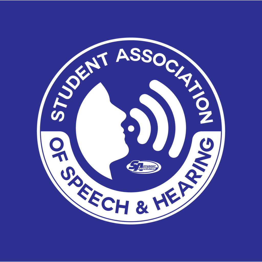
This logo redesign for the Student Association of Speech and Hearing (SASH) at the University at Buffalo was created to improve clarity, consistency, and usability. The previous logo lacked a modern visual structure, coherent design system, and responsiveness across different platforms.
The new logo introduces a cleaner, more contemporary look that scales effectively for both digital and print use. By refining the typography and visual form, the redesign creates a stronger, more professional identity while maintaining approachability. This updated mark better represents SASH as an academic and student-focused organization and ensures the logo functions clearly across websites, social media, and promotional materials.
PROCESS


FINAL

