OVERVIEW
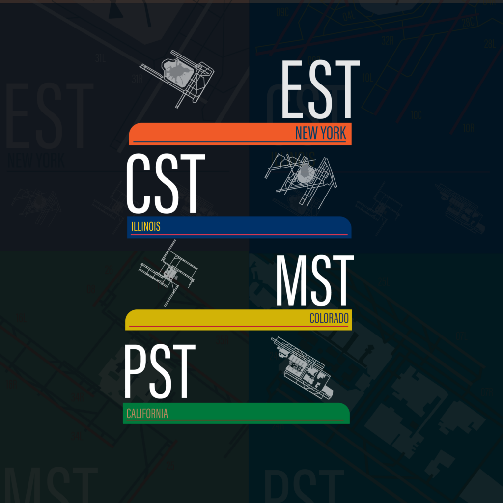
This project visualizes the most popular airports across each U.S. time zone in a poster and postcard format. Each selected airport is illustrated using simple line work to maintain visual consistency and focus on form rather than detail. The color palette for each design is drawn from the flag of the state in which the featured airport is located, reinforcing regional identity while creating clear visual variation across the series.
Contrast is used to emphasize the chosen airport within each composition. The selected airport is highlighted in full color, while unchosen airports appear at the bottom of the layout in white and gray, establishing a visual hierarchy and directing attention to the primary subject. Large typographic treatment identifies the time zone, while smaller, contrasting text indicates the state of the featured airport.
Together, these elements create a clean, informative system that connects geography, color, and typography to communicate both location and time zone in a simple, structured way.
PROCESS


FINAL

